Cards Against Isolation (Base Styles)
As promised last week, we’re stepping away from the testing and we’re going to start making this thing look semi-decent. The great thing about completing the testing phase first is that we can start making changes knowing the test suite will alert us if we break anything.
Install Tailwind CSS#
I’ve become a big fan of Tailwind CSS which provides a library of “utility classes”. For example, if you want to add positive margin to the top and bottom of an element, you would add “my-” followed by a number like:
<div class="my-4"></div>
Which translates to:
margin-top: 1rem;
margin-bottom: 1rem;
While this leads to a lot more classes in your HTML, it makes it incredibly fast to test out new ideas and creates consistency in your spacing, colour choices, transition times, etc.
The installation instructions for Tailwind tell you to run:
yarn add tailwindcss
but I’ve found that new versions of Tailwind come out regularly and they introduce drastic changes to the installation process so we’re going to lock the version to avoid discrepancies between this tutorial and what you see. Instead, run:
yarn add tailwindcss@2.0.2 postcss@8.2.1 autoprefixer@10.1.0 --tilde
The --tilde is like the twiddle wakka in the Gemfile, it will allow you to get
bug fixes but not jump to 2.1.0/8.3.0/10.2.0 or above.
Webpack#
That will install all the Tailwind files into your node_modules directory but
they aren’t actually loaded yet. Unfortunately, before we do that, we need to go
on another little story arc.
For the longest time, there wasn’t a comprehensive or standard way to manage assets. “Managing assets” could be resizing images, making CSS stylesheets smaller, transcoding new JavaScript to something more compatible, etc. Rails addressed this problem by creating the Asset Pipeline which is extraordinarily powerful. Since then, Webpack has swept the industry, particularly within the JavaScript community. To be honest, I find Webpack to be horrible to work with and dread when I need to configure it but it’s a standard. Since we installed Tailwind via Yarn, it is a JavaScript dependency and isn’t directly visible to Rails but it is visible to Webpack.
What we need to do is create a new CSS stylesheet that will be run through Webpack. Because this stylesheet will be completely independent of the one that runs through the Rails Asset Pipeline, it’s going to be easier to manage if it is kept in a separate place. This means you end up with two places that stylesheets can be in and, for that reason, I recommend only using the new directory.
Make a new directory at app/javascript/stylesheets (I’m going to use the
command line):
mkdir app/javascript/stylesheets
Then ask Tailwind to create a configuration file and move that file into the new directory:
npx tailwindcss init
mv tailwind.config.js app/javascript/stylesheets
Load Tailwind and the configuration file inside postcss.config.js:
module.exports = {
  plugins: [
    require('postcss-import'),
    require('postcss-flexbugs-fixes'),
    require('postcss-preset-env')({
      autoprefixer: {
        flexbox: 'no-2009'
      },
      stage: 3
    }),
    require('tailwindcss')('./app/javascript/stylesheets/tailwind.config.js'),
  ]
}
Create and open the new stylesheet at
app/javascript/stylesheets/application.css:
@import "tailwindcss/base";
@import "tailwindcss/components";
@import "tailwindcss/utilities";
This stylesheet needs to be compiled by Webpack. Modify
app/javascript/packs/application.js by adding the following to the bottom:
import "stylesheets/application"
Rails templates#
Finally, the new stylesheet needs to be loaded into the HTML. Rails uses a
layered approach to theming/templating. At the top-most level is
app/views/layouts/application.html.erb which should be used for the outer
elements that will exist on every page.
It is possible to have multiple layouts—maybe you want a completely different design for your homepage to your logged in pages—but we are going to stick with just one layout for everything.
The layout includes a line that says <%= yield %>. yield is a Ruby method
that allows the caller to pass in a block to be run. For a practical example:
def method_that_yields
  food = "garlic"
  yield(food)
end

method_that_yields { |food| puts "I love #{food}" }
# I love garlic

method_that_yields { |food| puts "I have a #{food} intolerance" }
# I have a garlic intolerance
Within the context of a template, the renderer loads the layout and yields the template for the page you are loading.
Adding the stylesheet to the page#
Open app/views/layouts/application.html.erb and replace:
<%= stylesheet_link_tag 'application', media: 'all' %>
with:
<%= stylesheet_pack_tag "application" %>
Tailwind should now be integrated but we should test to make sure. Load your
landing page in the browser (http://localhost:3000). Make sure you have the
Rails server running in a terminal tab (rails s).
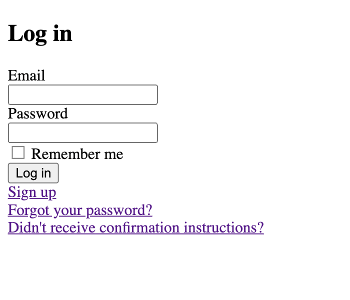
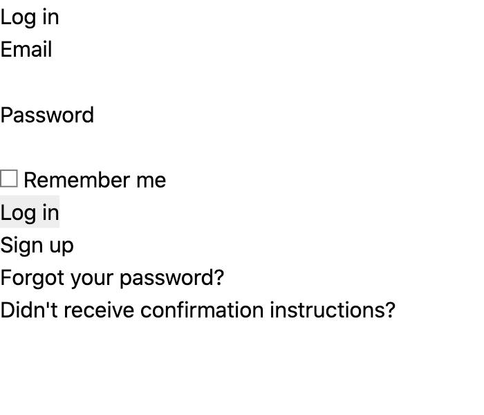
Tailwind removes the default styles from the page so, if it’s running, your form will be even more ugly than before.
Before Tailwind
After Tailwind
Commit:
rubocop
rspec
git status
git add --intent-to-add [paste any untracked files]
git add --patch
git commit
Install Tailwind CSS
Build the frame#
Not only do we want to start simple but I’m really not a designer so don’t expect anything too fancy here. I’m thinking that we need some kind of simple header bar and a content area. I wouldn’t mind being a little creative in the content area but that’s not something I want to consider until I have a working application—having the prettiest registration page isn’t much use if the game doesn’t work. I also know that there is going to be a fair bit of work involved in getting the game mechanics working and so I really don’t want to get bogged down here.
Saying this, it’s absolutely vital that the app be built in a responsive manner. Not only could it be used on many devices from computers to mobiles, I fully expect this to happen. I like to have Zoom running on my computer while I use my phone for a game whereas I know people who like to do everything on their computer. These days, there really isn’t an excuse for not building responsively.
We’ll start at the top of app/views/layouts/application.html.erb and work our
way down.
The title tag is used for the name shown in the browser tab and in search
engines so, while it’s not super important for a practice app, it should be set
to something semi-respectable.
<title>Cards Against Isolation</title>
This is the only simple change I’d like to make before building the page header so I’d like to make a commit now. Rubocop doesn’t check our HTML and we haven’t (yet) built any tests for our own code so we can jump straight in:
git add --patch
git commit
Replace default page title
Also inside the head is a placeholder for any JavaScript generated by Webpack:
<%= javascript_pack_tag 'application' %>
Browsers do an amazing job of hiding an extraordinary amount of complexity from us. When loading a page, (a massive oversimplification is that) the browser will read from top to bottom, rendering each piece as it goes. By default, when the browser reaches a CSS stylesheet or JavaScript, it will stop rendering. This is because either could change the elements on the page and so it could render elements only to find it needs to re-render.
For CSS, this is fine, we want our page to be rendered with the styles already applied. It does mean that you should keep your CSS lean so it loads quickly but we have no reason to be concerned about the browser holding up rendering.
On the other hand, while it’s possible for JavaScript to instantly modify the page, you should be thinking of JavaScript as an enhancement to the page. The first view of your page should look the same whether or not the JavaScript has loaded.
It’s easy to think “the internet is pretty fast these days; how long could the
delay really be‽” When you load CSS and JavaScript, it’s important to remember
that the delay is not just downloading the file, the browser then needs to parse
and action the file. Even if you can keep that delay to less than a second,
your users notice it. The original way to avoid this issue was to place the
script tags at the bottom of the page so they are loaded after the rest of the
page has rendered. These days,
browser support for the defer attribute
is very good.
defer tells the browser to start downloading the file in the background but
don’t run the script until the browser has a complete representation of the
page. While we look at pretty things on displays, the browser thinks about the
world in a more abstract fashion. The browser’s internal representation of the
page is called the Document Object Model (or DOM). Parsing of deferred scripts
happens when the DOM is loaded.
If you use JavaScript to react to user input (e.g. show a popup when a button is clicked), that functionality won’t be ready when the page is first shown but, if someone can find and click a button faster than the browser can run your script, you have bigger issues with your JavaScript than the fact it’s being deferred.
Your users’ perception of load time is far more important than the actual load time. By getting elements onto the page quickly, people feel like your site is really fast whether or not that is true.
Add the defer attribute to the script and change from single to double-quotes:
<%= javascript_pack_tag "application", defer: true %>
Even though this is in a .erb file, anything inside the <%= %> tags is Ruby
code and, as such, should follow the same style conventions we use in a .rb
file.
We should commit this small change because it may not be obvious why we need to defer the script. These sorts of obscure changes are a good candidate for a detailed commit message so that, if you or someone else in the future needs to understand the intent, the explaination is easy to find.
git add --patch
git commit
Defer loading of application JavaScript
Browsers need to stop rendering a page while they download and parse JavaScript files. This increases the perceived load time of the page and decreases user satisfaction.
The
deferattribute allows the browser to download the JavaScript in the background and only parse it once the DOM has loaded
Be careful to leave in the line breaks in the commit message. Like your code, if your commit message line-length is too long, it will be difficult to read.
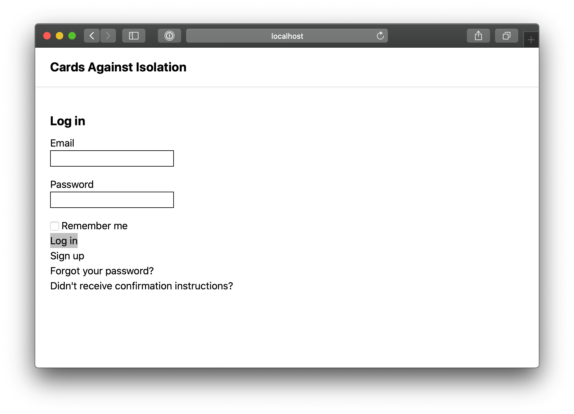
Header bar#
Initially, the header of the app is going to be extremely simple with nothing more than the name of the application. It’s common to have a menu in the header but I’m thinking that we should defer building navigation as long as possible.
When you are logged out, a navigation bar would include sign-in and register, both of which have links in the content. When you are logged in, there is dashboard, a game, and sign-out. Since dashboard is the root page for a logged in user, we can allow people to click the name of the application in the header to get to root and that acts as a dashboard button. From the dashboard, players will be able to see and select a game. This does mean we are missing a sign-out button but, while we will want to add one of those, it isn’t necessary to prove out the concept so it’s a later problem.
While navigation doesn’t sound particularly difficult to build, we would want to add tests that prove it works correctly based upon the authentication status of the player and create a separate, compact mobile-friendly menu. I’ve been doing this long enough to know that most things that sound easy come along with unexpected baggage and you should keep focus on the staples before you accessorise.
This is the frame for the header bar:
  <body>
    <header class="px-6 py-4 shadow"></header>
The header is a full-width (or block) element to which I’ve applied padding of
1.5rem on the left and right (x), 1rem on the top and bottom (y), and a thin
drop shadow underneath.
rem is a unit of measure relative to the font-size of the root element. The
“root element” refers to the html tag at the top of the page. Most browsers
default that font-size to 16px but users can change this value to suit their
needs. Using the root font-size as a reference allows your app to scale
responsively to the desires of the reader. If someone hard of sight needs to
zoom the page, they won’t end up with large text that feels constrained in the
container, the padding will increase to provide the same relative amount of
breathing room.
Clearly there is no direct relationship between 6 and 1.5rem or 4 and 1rem, Tailwind simply assigns sensible default values and, rather than worrying about the specific values being used, you focus on the relative size of things.
The same can be said of shadow; we could break down the specific settings used
but all that really matters is that it is a sensible default. If you want
something bigger or smaller, Tailwind
offers options to suit your needs.
You can keep focus on building a consistent interface quickly without getting
bogged down in the detail.
Now all we need is a link to the root page:
<header class="px-6 py-4 shadow">
  <%=
    link_to "Cards Against Isolation",
            root_path,
            class: "font-bold text-xl"
  %>
</header>
There are lots of ways you could format those links. Many people would put everything on one line like:
<%= link_to "Cards Against Isolation", root_path, class: "font-bold text-xl" %>
Others might use multiple lines but in a different way. I’m a big fan of using white space. I find HTML documents can be difficult to read and a bit of space helps me parse the text. This is the same reason why I like to use lots of small ERB files that I include as partials. I’ve been fighting my instinct to break this document into a few smaller files because I don’t want to promote early refactoring but, for me, it’s less about trying to create re-usable components and more about my own readability.
This is not the sexiest header, but it’ll work for now.
It’s clear that the body copy is too high; we could use some padding between the header bar and the body:
<main class="p-6">
  <% if notice %>
    <p class="notice"><%= notice %></p>
  <% end %>
  <% if alert %>
    <p class="alert"><%= alert %></p>
  <% end %>

  <%= yield %>
</main>
The main tag defines the primary content of the page and also helps users of
screen readers to skip to the “main” part of the document. It’s important that
this doesn’t include any “side” content so, if the structure of our pages
changes in the future, it’s possible this will no longer be correct but, while
we are keeping it simple, it will work well.
That’s it for the frame—for now at least—time to commit:
rspec
git add --patch
git commit
Create header bar and give the main content some breathing room
Style the Devise forms#
As with the header bar, I don’t want to get too bogged down styling the Devise forms but, with all the styling gone, they are almost unusable. I’d like to define some basic styles without doing too much.
To be honest with you, right now I have a “wireframe” idea of how the finished app is going to look but that isn’t anywhere near enough fidelity for me to be locking myself into a design system. No doubt, there are more design-focused people who can already see a picture emerging but that’s not me. I want to get a better feel for the components not yet built and then consider how to create a consistently pleasant interface.
While we will mostly be adding Tailwind classes to HTML elements to create style, there are some styles that will be used everywhere and are better set at a global level.
Open app/javascript/stylesheets/application.css and add a new include:
@import "tailwindcss/base";
@import "shared/base";
@import "tailwindcss/components";
@import "tailwindcss/utilities";
Then create the new CSS file at
app/javascript/stylesheets/shared/base.css:
h1 {
  @apply font-bold;
  @apply text-2xl;
  @apply mb-4;
}

h2 {
  @apply font-bold;
  @apply text-xl;
  @apply mt-4;
  @apply mb-2;
}
Thanks to the combination of Webpack and PostCSS, we can “apply” Tailwind classes so we can be sure we are being consistent.
Margin is defined in the same was a padding so, in h2, this is applying margin
of 1rem on top and 0.5rem on the bottom. If you are not familar with Tailwind,
you’ll pick up on those labels really quickly.
Not having an outline on the input fields is quite problematic; you can’t even see where the inputs are in most browsers.
input[type="email"],
input[type="password"],
input[type="text"] {
  @apply border;
  @apply border-black;
  @apply mb-4;
}
Now the inputs can at least be seen.
As for the submit buttons:
input[type="submit"] {
  @apply bg-gray-800;
  @apply transition;
  @apply ease-in-out;
  @apply duration-150;

  @apply border;
  @apply border-transparent;

  @apply font-medium;
  @apply text-white;

  @apply my-4;
  @apply px-4;
  @apply py-1;
}

input[type="submit"]:focus {
  @apply bg-gray-700;

  @apply outline-none;
  @apply shadow-outline;
}

input[type="submit"]:hover {
  @apply bg-gray-700;
}
First the background colour of the button is set to a dark grey:
input[type="submit"] {
  @apply bg-gray-800;
Then it is being set to a slightly lighter grey on hover and focus:
input[type="submit"]:focus {
  @apply bg-gray-700;
  ...
}

input[type="submit"]:hover {
  @apply bg-gray-700;
}
Focus occurs when the element is selected by some means over than hovering with a mouse. For example, pressing the tab key until the input is selected would result in a focus event.
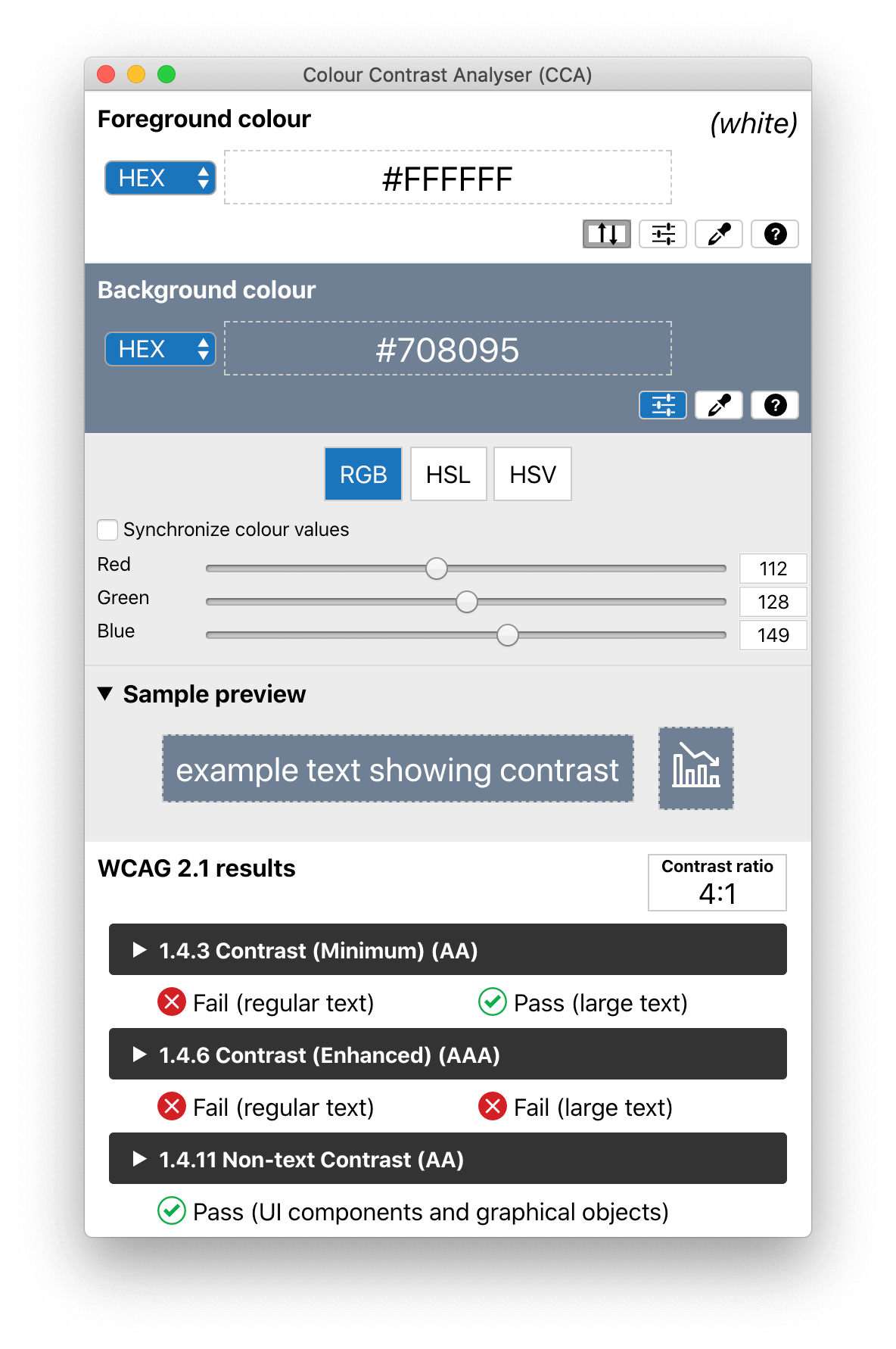
It’s worth taking a quick detour to discuss how I picked 800 and 700. While a
lot of the decision making was simply “find something that gets the job done”,
I originally picked the lighter, 600. When picking background colours that sit
behind text, I check to make sure there is enough contrast for people with less
than perfect sight. My preferred way to do this is using the application,
Colour Contrast Analyser,
which is supplied by Vision Australia. When using 600, the contrast didn’t
meet the requirements for the AA standard.
While there is a lot more to being fully compliant with the Web Content Accessibility Guidelines (WCAG) AA standard than having good contrast, meeting a minimum contrast standard is such an easy win. I’m only in my 30’s and already I notice the difficulty of aging eyes so sites with poor contrast frustrate me.
While I’m not spending any real time on pretty things, I did add:
input[type="submit"] {
  ...
  @apply transition;
  @apply ease-in-out;
  @apply duration-150;
This adds a subtle animation on the change of the background colour. Given how easy it is to add Tailwind styles, it seemed like a nice addition for a couple of seconds of work.
When an input receives focus, the browser adds an outline to help with distinguishing which input is selected. The default styling is pretty ugly, so it is removed with:
@apply outline-none;
Since the outline exists as an accessibility feature, it’s important to replace it with something else. Tailwind offers a shadow that is a little nicer:
@apply shadow-outline;
The last thing to fix is the inability to see when text is a link:
a {
  @apply underline;
}
While the order of those styles doesn’t matter in a technical sense, I placed
this under the h2 styles because my mind thinks of anchors as being another
level of text styling and so, when I need change the styles, I’m going to find
it easier to locate them there.
This change has the unintended consequence of adding an underline to the name in
the header bar. Thankfully, Tailwind has a solution to this too. Jump back into
app/views/layouts/application.html.erb and add the no-underline class to
the header link:
<%=
  link_to "Cards Against Isolation",
          root_path,
          class: "font-bold text-xl no-underline"
%>
That’s all the styling we are going to do for now; anything else can wait until later.
git add --intent-to-add app/javascript/stylesheets/shared/
git add --patch
git commit
Add base CSS styles
Tailwind CSS includes normalize.css which removes all the default styling from elements. These styles do just enough to make the interface functional without introducing a true design
Tailwind upcoming changes#
I noticed that I was getting warnings from Tailwind in the console about upcoming changes in version 2.0. It is worth preparing for those changes and getting rid of the warnings.
Open app/javascript/stylesheets/tailwind.config.js and adjust to look like
this:
module.exports = {
  future: {
    purgeLayersByDefault: true,
    removeDeprecatedGapUtilities: true,
  },
  purge: [],
  theme: {
    extend: {},
  },
  variants: {},
  plugins: [],
}
Even though we didn’t change anything that should matter, I still ran my test suite before committing as a way of checking that the new settings didn’t break the site.
rspec
git add --patch
git commit
Opt into Tailwind upcoming, breaking changes
Code review#
My code at this point is available to review on GitHub.